Overview
The Brief
–
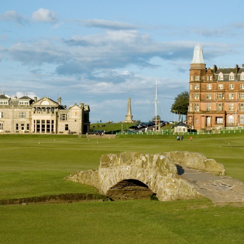
Create a name and new brand identity for sports rehabilitation business that predominantly serves the students of St Andrews University and visiting golfers.
The Solution
–
The acronym START is intended to have positive connotations associated with both mobility and the beginning of the rehabilitation journey.
The visual aspect of the identity is dynamic, positive and strong and deliberately asexual. The concentric circles representing targets, both personal and medicinal.
- Categories BRAND IDENTITY, DESIGN FOR PRINT, LOCAL PROJECTS