The Brief – Public relations campaign fronted by television personality Gloria Hunniford, funded by pharmaceutical company Lilly. The brief was to create an engaging identity and series of information literature to appeal to a female audience about the effects of the menopause and constructive advice on how best manage this change. The Solution – […]
Read MoreThe Brief – Create an identity to promote a new annual golf tournament where pairs of brothers join together to play a professionally run event on some of the finest Scottish Links courses including St Andrews & Kingsbarns. The Solution – The integrated B’s symbolising the joining of brothers as a team created as […]
Read MoreThe Brief – Create a name and new brand identity for sports rehabilitation business that predominantly serves the students of St Andrews University and visiting golfers. The Solution – The acronym START is intended to have positive connotations associated with both mobility and the beginning of the rehabilitation journey. The visual aspect of the […]
Read MoreBrand development for an outdoor tourism destination located in the heart of Scotland. The new symbol to represent Breadalbane takes its inspiration from the environment of the highlands. From mysterious and ancient stone cup rings to trees and wetlands formed over thousands of years.
Read More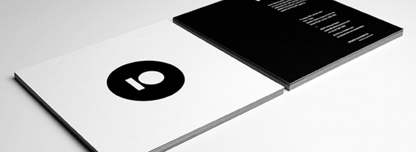
Project Overview – Invite design for Weber Shandwick’s 10th anniversary party. The event was held at the Saatchi Gallery in London, I wanted to produce something special/contemporary to reflect that. Foiled “10” to GF Smith Colorplan on the front-side, duplexed with Ebony Colourplan and foiled text on the back-side.
Read More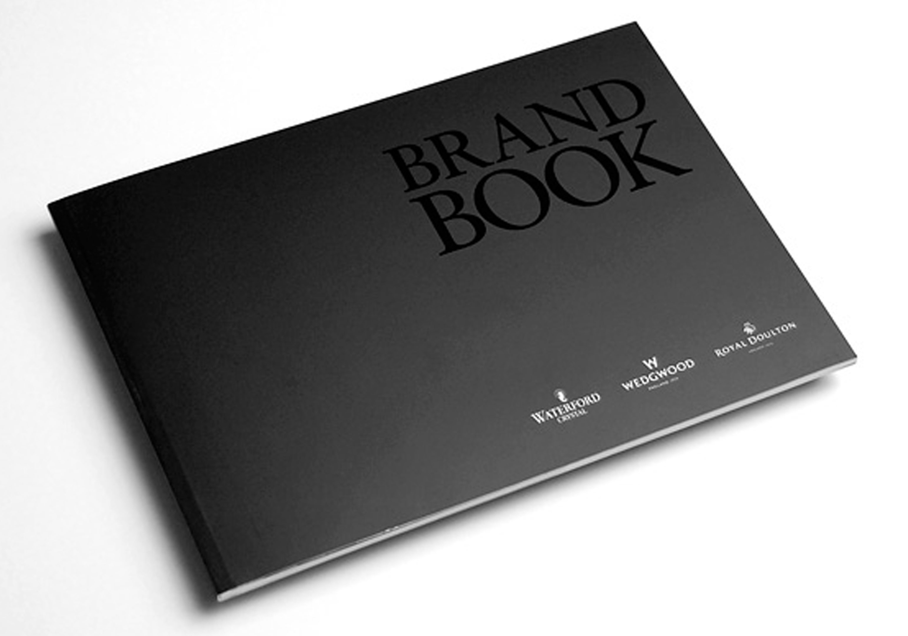
Project Overview – Brand book produced on behalf of Slam PR for WWRD showcasing products of their Waterford Cystal, Wedgewood and Royal Doulton brands. The cover features a Spot UV finish on the words “Brand Book” and a matt laminated cover. Internal pages are set with elegant and sophisticated typography and printed on a premium […]
Read More
Project Overview – Commissioned by adidas and H+K Strategies we created the packaging and contents to present Lionel Messi’s signature football boots. The box contained a flat screen video showcasing Leo’s footballing mantra, four golden balls representing the four Ballon d’ors he has won, fake grass and of course the football boots. www.hkstrategies.com
Read More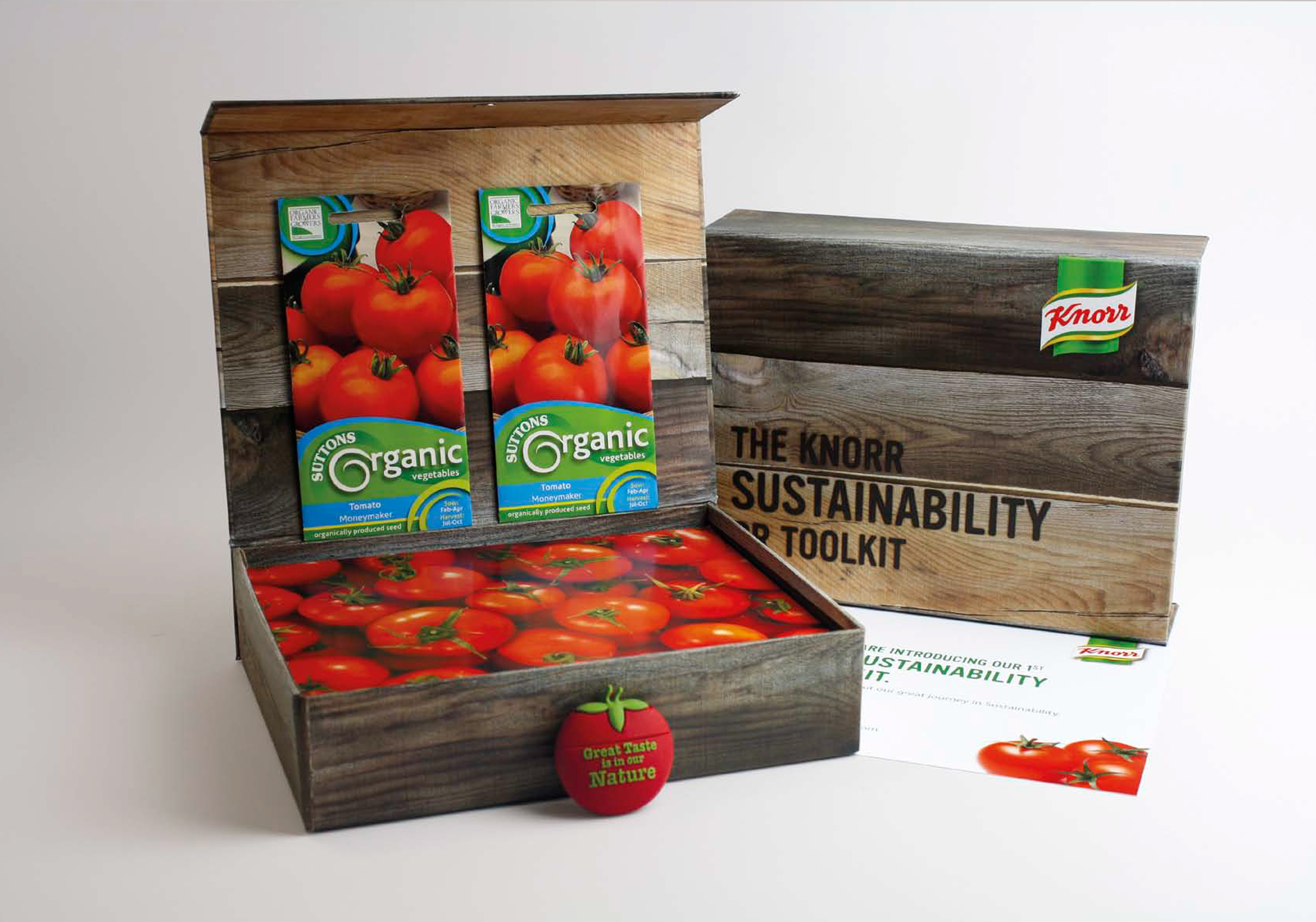
Project Overview – What better way to send our information about sustainability than in a recycled crate (box) that contains all Press information on a Tomato shape USB along with information cards and seeds pack.
Read More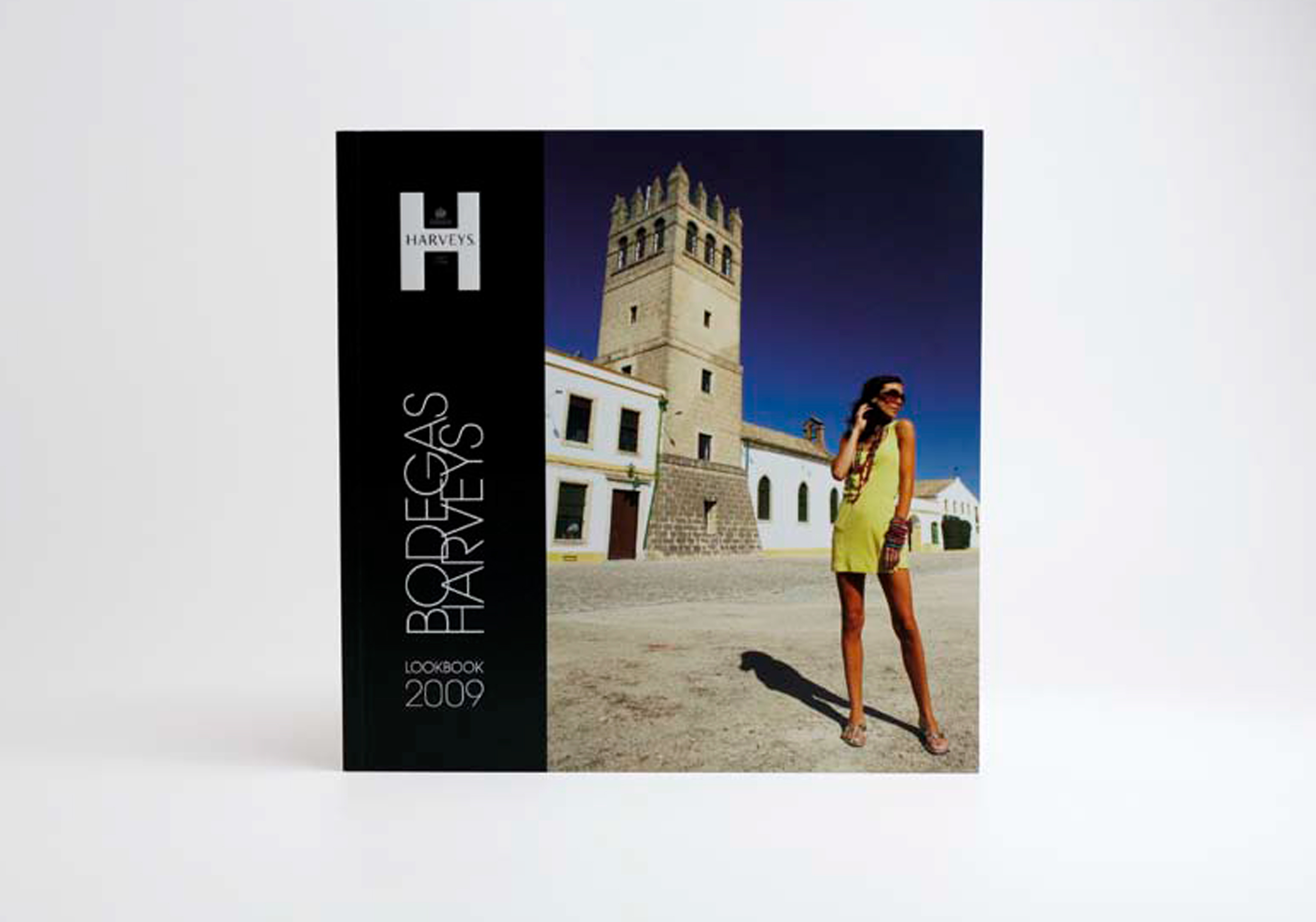
Project Overview – To grab attention and promote the latest offering from Harveys, we worked with Focus PR to create a ‘glamorous’ visual approach fro the sherry brand creating a mini coffee table book.
Read More
Project Overview – Greybridge were commissioned to create a new identity and marketing strategy to help St Andrews based print management company Formlink differentiate itself from the thousands of competitors who were offering a similar print purchasing service. Aside from the standard brand identity guidelines, the identity was implemented over all areas of branding including […]
Read More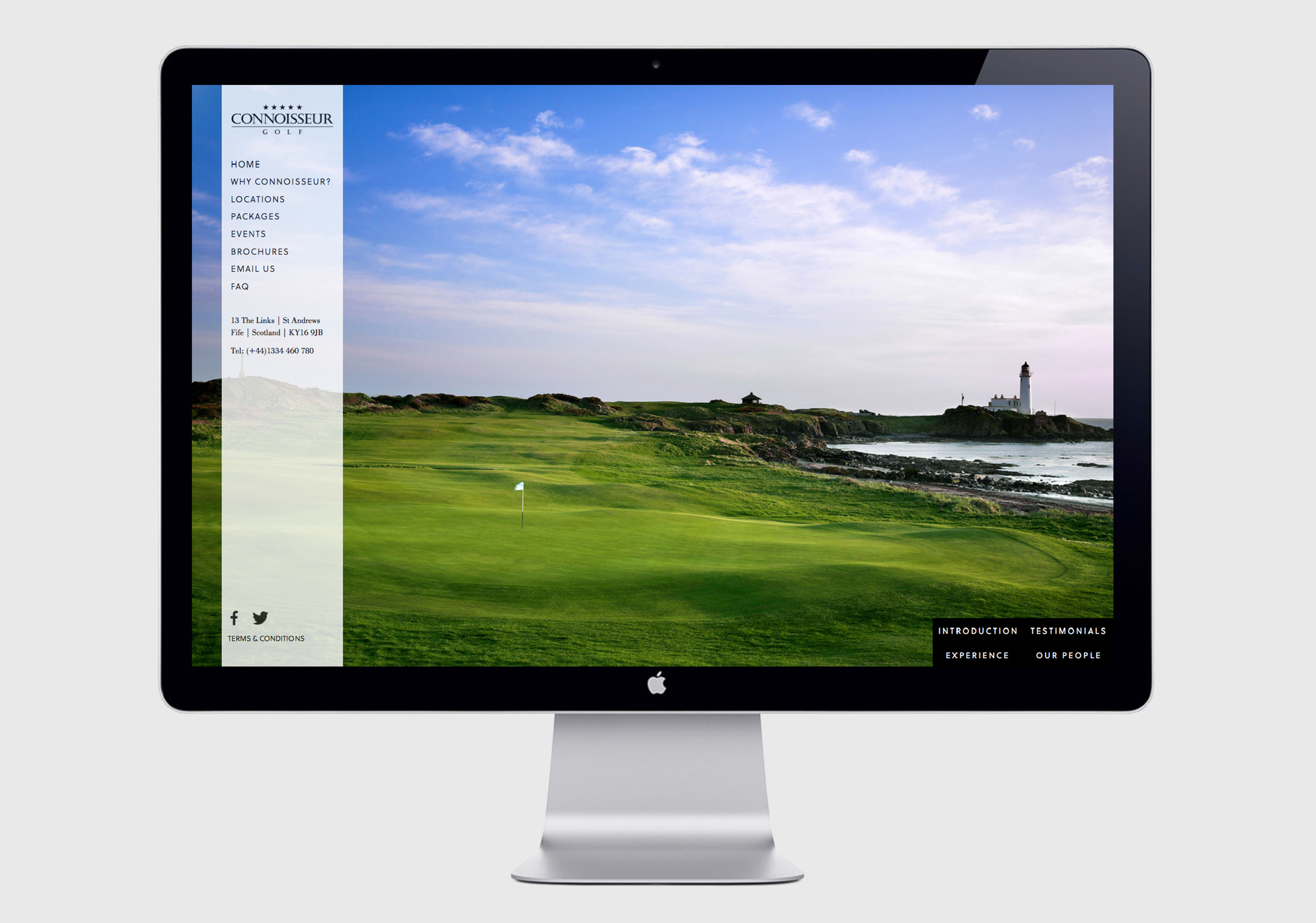
Project Overview – Based in St Andrews, Scotland, the spiritual home of golf, luxury golf tour operators commissioned Greybridge to help clarify its brand positioning and developed a series of promotional materials to reflect the prestige of its brand. A clarification of its corporate identity and guidelines was developed allongside a new internet presence, promotional […]
Read More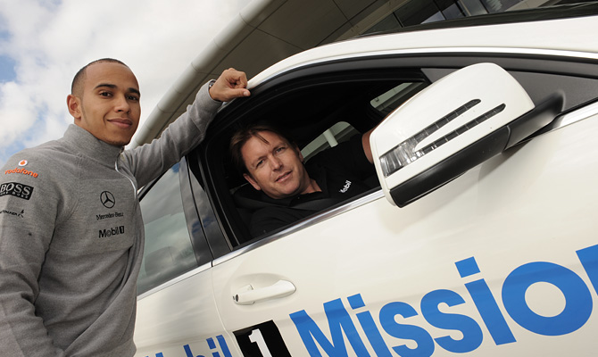
Project Overview – Weber Shadwick approached us to brand a white Mercedes E Class Estate for a forthcoming campaign for Exxon Mobil. The campaign involved automotive enthusiast James Martin touring the UK searching to find Britain’s best and worst roads in the specially kitted-out Mobil 1 car (using state-of-the-art tracking technology) and reporting back with the results. […]
Read MoreProject Overview – Weekly, 5km, timed, free running for all. parkruns are friendly events organised by fantastic local volunteers. The project included brand and identity development from logo generation and style guides through to apparel, website development and video production.
Read More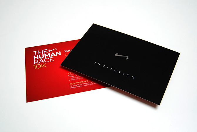
Project Overview – Working with sports giant Nike to create a VIP package that they could mail to celebrities encouraging them to take part in the UK leg of the Nike Human Race. The VIP mailer consists of a uniquely numbered running vest, Nike+ SportBand, socks and an invite. We sourced the perfect box to […]
Read More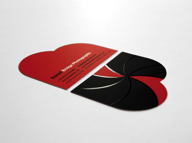
The Brief – Sister companies Blue Bear Production and Bridge Photographic wanted to create a new identity to help demonstrate the close links between the disciplines. The Solution – The identities and sites are intended to refelect the agencies young, dynamic ethos. A “less is more” approach to the site design allows the production […]
Read More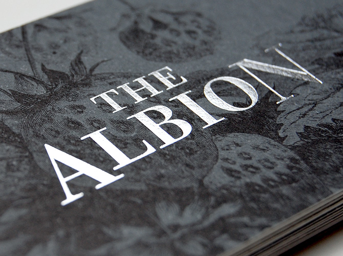
The Brief – The Albion, situated in Barnsbury, Islington, produces some of the best Pub food in London but lacked any sort of brand identity. The Solution – We created an identity to reflect the of quality and traditional nature of its food and decor. All material was printed on uncoated paper stocks, colours working […]
Read More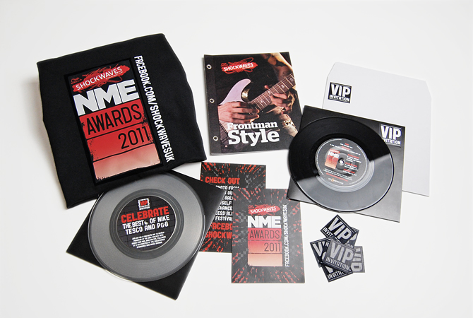
The Brief – Hill & Knowlton PR approached us to create a wide range of branded materials for the 2011 Shockwaves NME music awards. We designed a campaign style and applied to a wide variety of merchandise including; event branding, invitations, t-shirts plus promotional leaflets and booklets. The VIP invite creative involved us sourcing old […]
Read More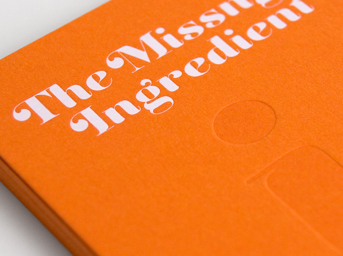
The Brief – Startup PR and market research agency “The Missing Ingredient” who specialise in consumer food brands asked us to create a distinct corporate identity and implement its key messages through digital and printed media. The Solution – The subtle typographic solution plays with the missing ‘i’ with the styling of the identity […]
Read More
The Brief – To Be Bond is a British events company, who offer a unique role play experience, targeted at wealthy men looking to live life as James Bond for 24 hours. To Be Bond jetset their customers around Europe on a bespoke mission doing all the things you would expect of James Bond; jumping […]
Read More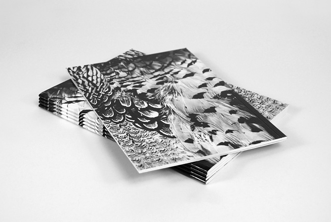
The Brief – SLAM PR commissioned us to design a lookbook for Filofax for London Fashion Week. Filofax wished to reposition itself as a luxury brand showcasing organisers from their premium range.
Read More
Project Overview – Ermyn Lodge were looking for a fresh new identity for their stud farm in Epsom. It seemed like a natural solution to include the ‘winners post’ as the key mark in the solution. The project included the art direction of photography, design of all marketing materials and a fully content managed website.
Read More
The Brief – Create an identity for a 5 star fine dining restaurant for The Grange, located in a 17th century converted farmhouse with wonderful views overlooking the royal & ancient town of St Andrews and its harbour. The Solution – The farmland surrounding the stunning property is home to a variety of wildlife […]
Read More
The Brief – Create a unique identity for an up market, contemporary Thai restaurant, including the interior design and application of the identity to all materials including menus, signage, advertising and website. The Solution – The flavours of the dishes at Nahm-Jim are authentic and traditional with all key ingredients flown in weekly from […]
Read More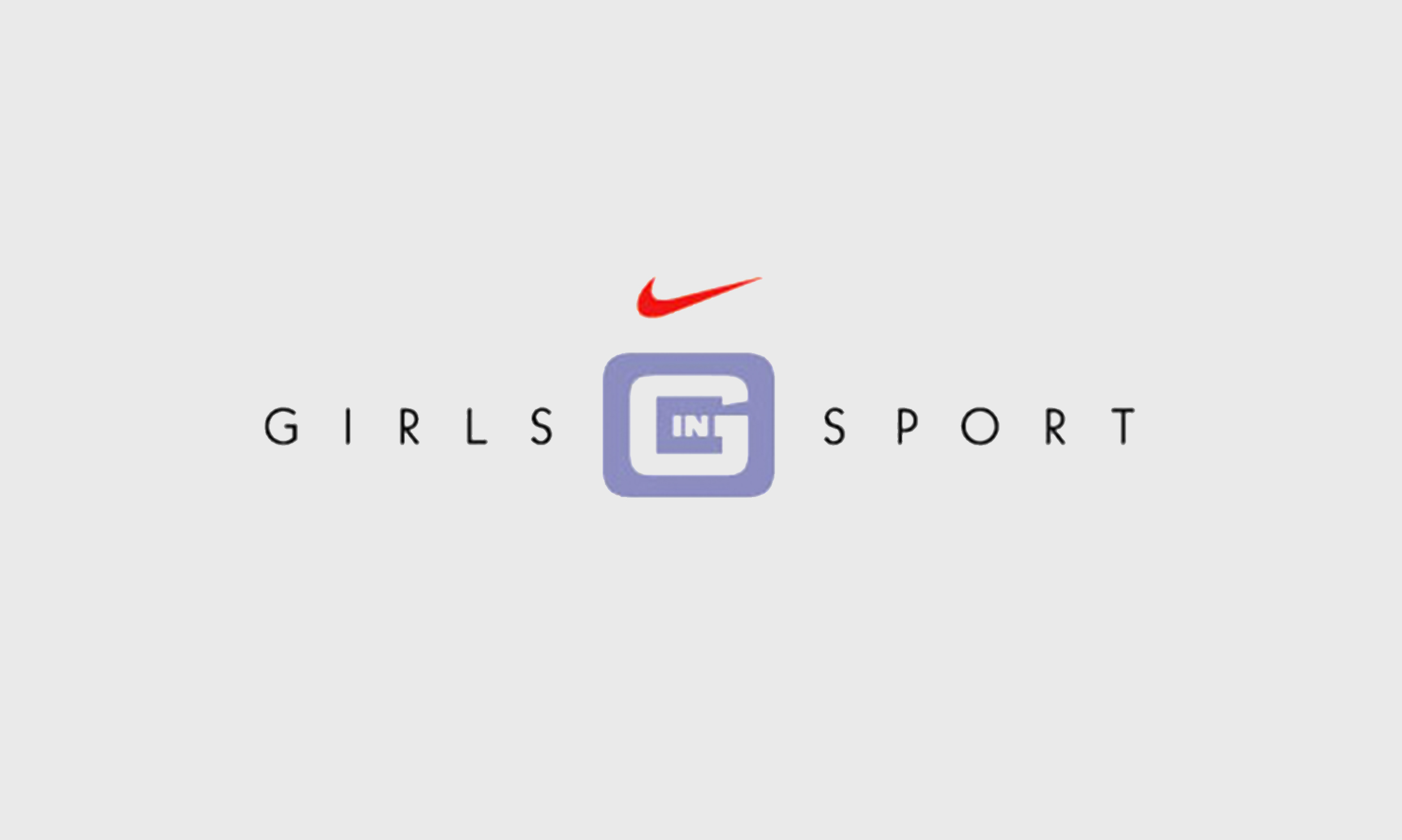
The Brief – Create an identity to be used in a national UK based campaign to encourage the active participation in sport by teenage girls. The Solution – A sporty and youthful identity using a muted palette of feminine colours together with the Nike swoosh. The campaign also used a series of engaging photographic […]
Read More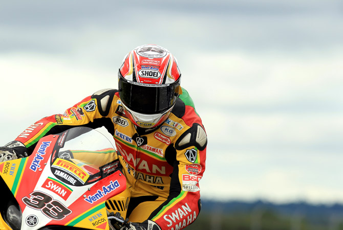
Swan approached us to create the branding and livery collateral for their British Super Bike Racing Team. This included designs for the race bikes, rider leathers, team apparel, race trailers, pit garage, hospitality unit and website among many other items. The 2011 British SuperBike Season was the perfect year as they had a terrific season, winning the championship. Tommy Hill was crowned champion by 0.006 seconds after a thrilling last lap scrap.
Photography courtesy of Tim Keeton
–
Swan Yamaha
www.swanyamaha.co.uk