Brand development for an outdoor tourism destination located in the heart of Scotland. The new symbol to represent Breadalbane takes its inspiration from the environment of the highlands. From mysterious and ancient stone cup rings to trees and wetlands formed over thousands of years.
Read More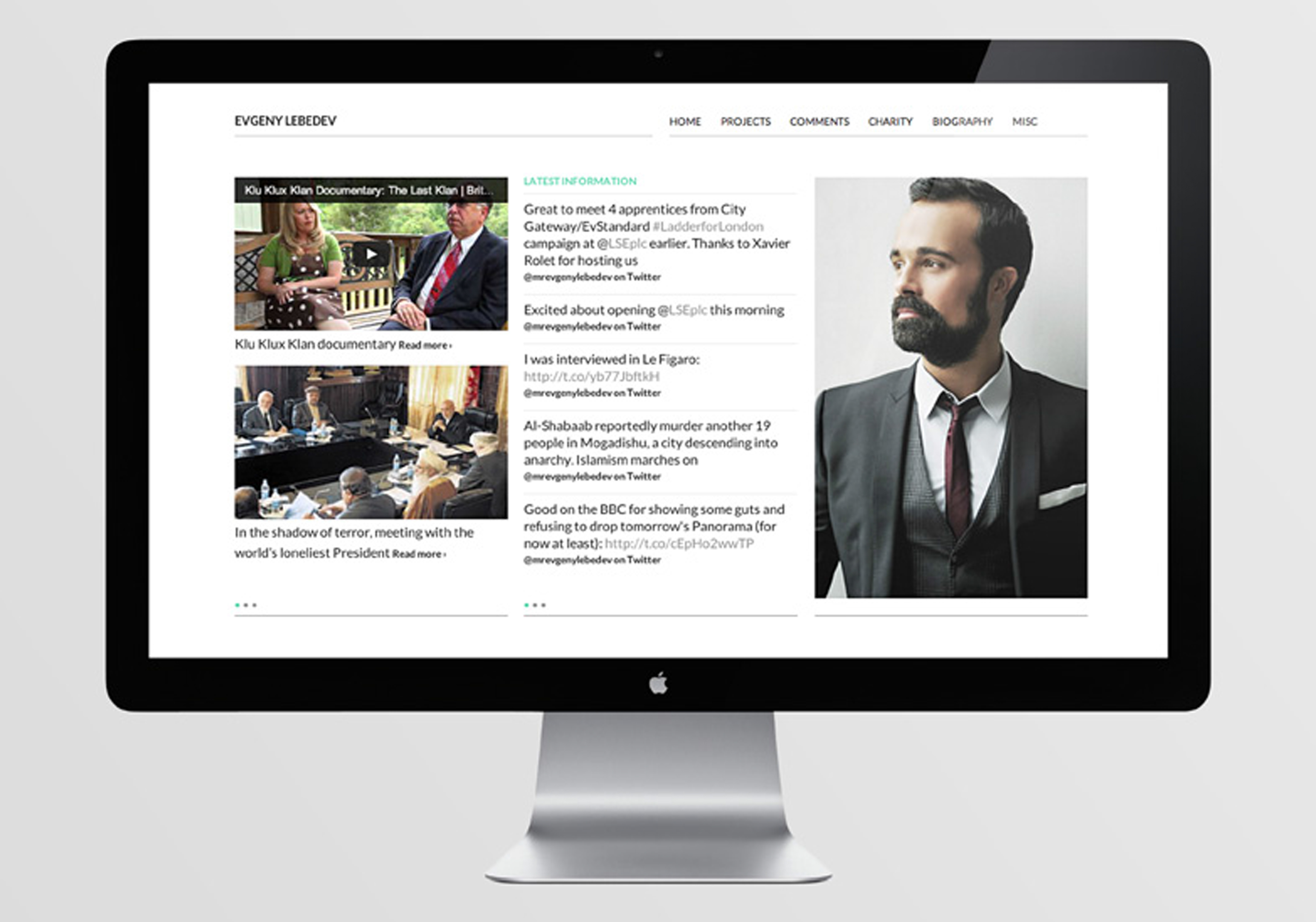
Project Overview – Personal website for Evgeny Lebedev, owner of the Independent newspaper group and Evening Standard. www.evgenylebedev.com
Read More
Project Overview – Greybridge were commissioned to create a new identity and marketing strategy to help St Andrews based print management company Formlink differentiate itself from the thousands of competitors who were offering a similar print purchasing service. Aside from the standard brand identity guidelines, the identity was implemented over all areas of branding including […]
Read More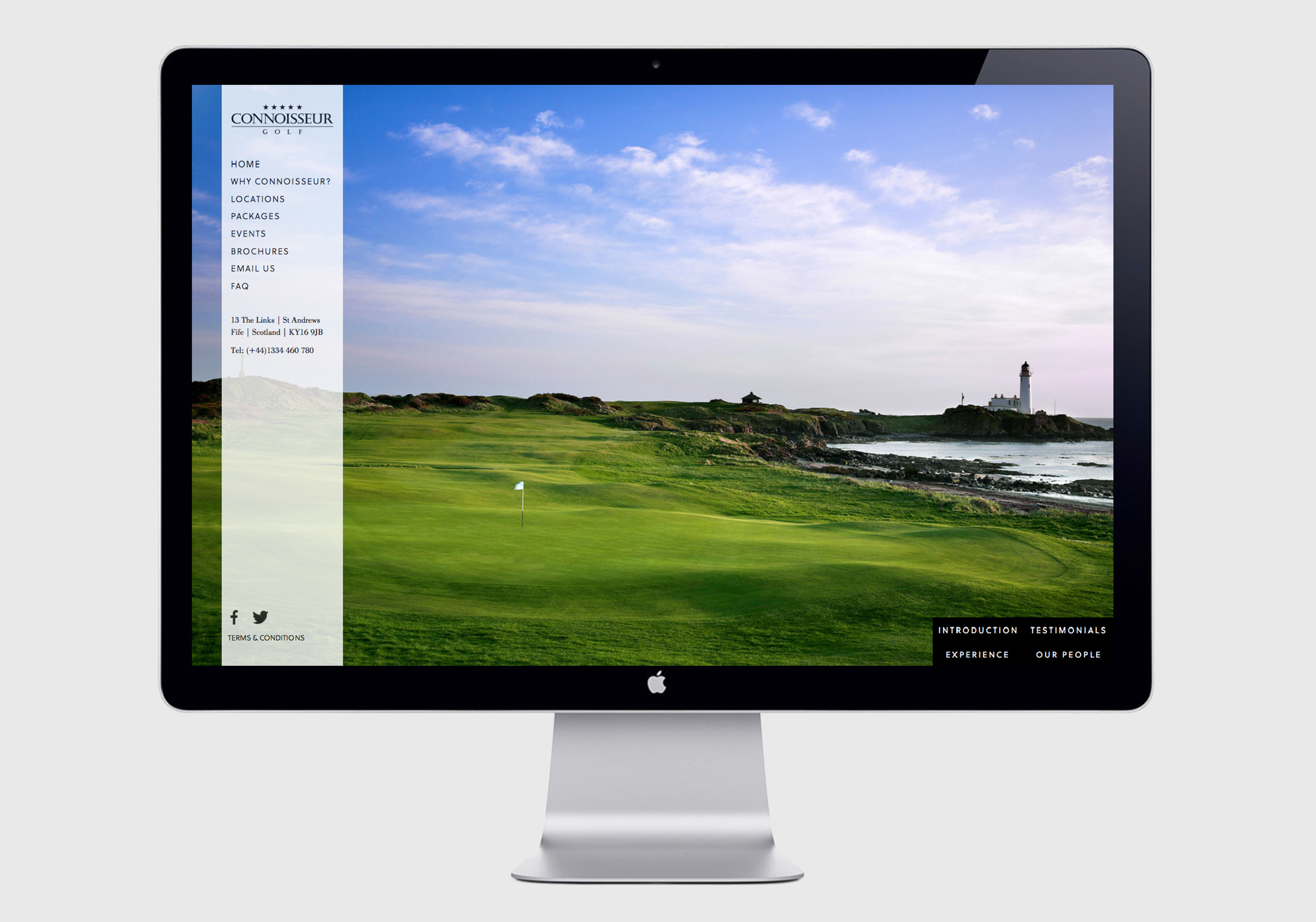
Project Overview – Based in St Andrews, Scotland, the spiritual home of golf, luxury golf tour operators commissioned Greybridge to help clarify its brand positioning and developed a series of promotional materials to reflect the prestige of its brand. A clarification of its corporate identity and guidelines was developed allongside a new internet presence, promotional […]
Read More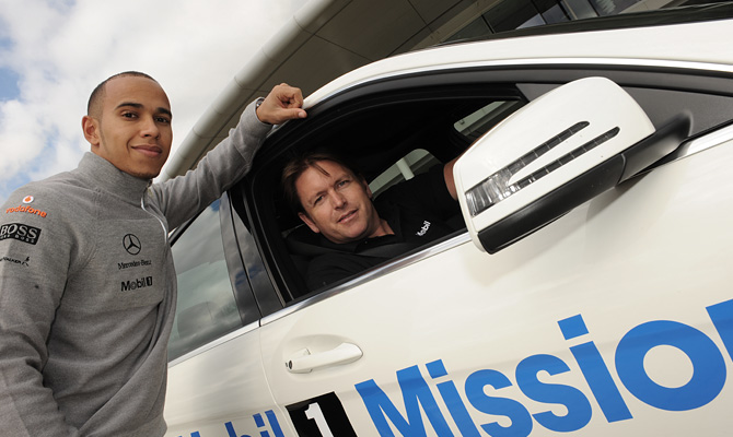
Project Overview – Weber Shadwick approached us to brand a white Mercedes E Class Estate for a forthcoming campaign for Exxon Mobil. The campaign involved automotive enthusiast James Martin touring the UK searching to find Britain’s best and worst roads in the specially kitted-out Mobil 1 car (using state-of-the-art tracking technology) and reporting back with the results. […]
Read MoreProject Overview – Weekly, 5km, timed, free running for all. parkruns are friendly events organised by fantastic local volunteers. The project included brand and identity development from logo generation and style guides through to apparel, website development and video production.
Read More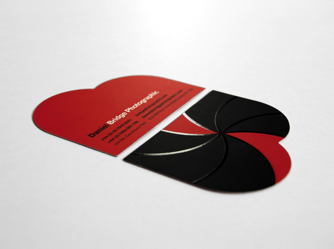
The Brief – Sister companies Blue Bear Production and Bridge Photographic wanted to create a new identity to help demonstrate the close links between the disciplines. The Solution – The identities and sites are intended to refelect the agencies young, dynamic ethos. A “less is more” approach to the site design allows the production […]
Read More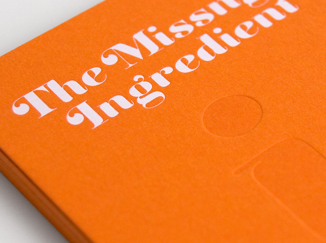
The Brief – Startup PR and market research agency “The Missing Ingredient” who specialise in consumer food brands asked us to create a distinct corporate identity and implement its key messages through digital and printed media. The Solution – The subtle typographic solution plays with the missing ‘i’ with the styling of the identity […]
Read More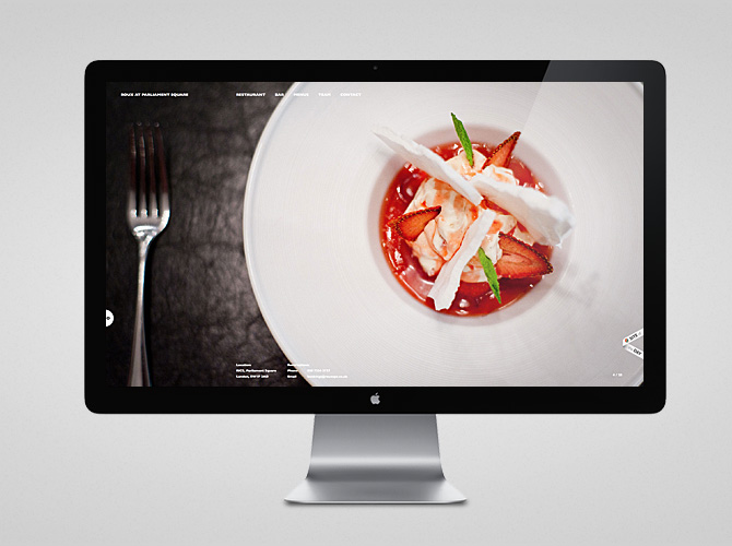
The Brief – Design and develop a website and mobile application for Restaurant Associates on behalf of Mason Williams PR. A fully content-managed site built in HTML5 and CSS3, using jQuery for content animation. Photography by Paul Winch-Furness.
Read More
The Brief – To Be Bond is a British events company, who offer a unique role play experience, targeted at wealthy men looking to live life as James Bond for 24 hours. To Be Bond jetset their customers around Europe on a bespoke mission doing all the things you would expect of James Bond; jumping […]
Read More
Project Overview – Ermyn Lodge were looking for a fresh new identity for their stud farm in Epsom. It seemed like a natural solution to include the ‘winners post’ as the key mark in the solution. The project included the art direction of photography, design of all marketing materials and a fully content managed website.
Read More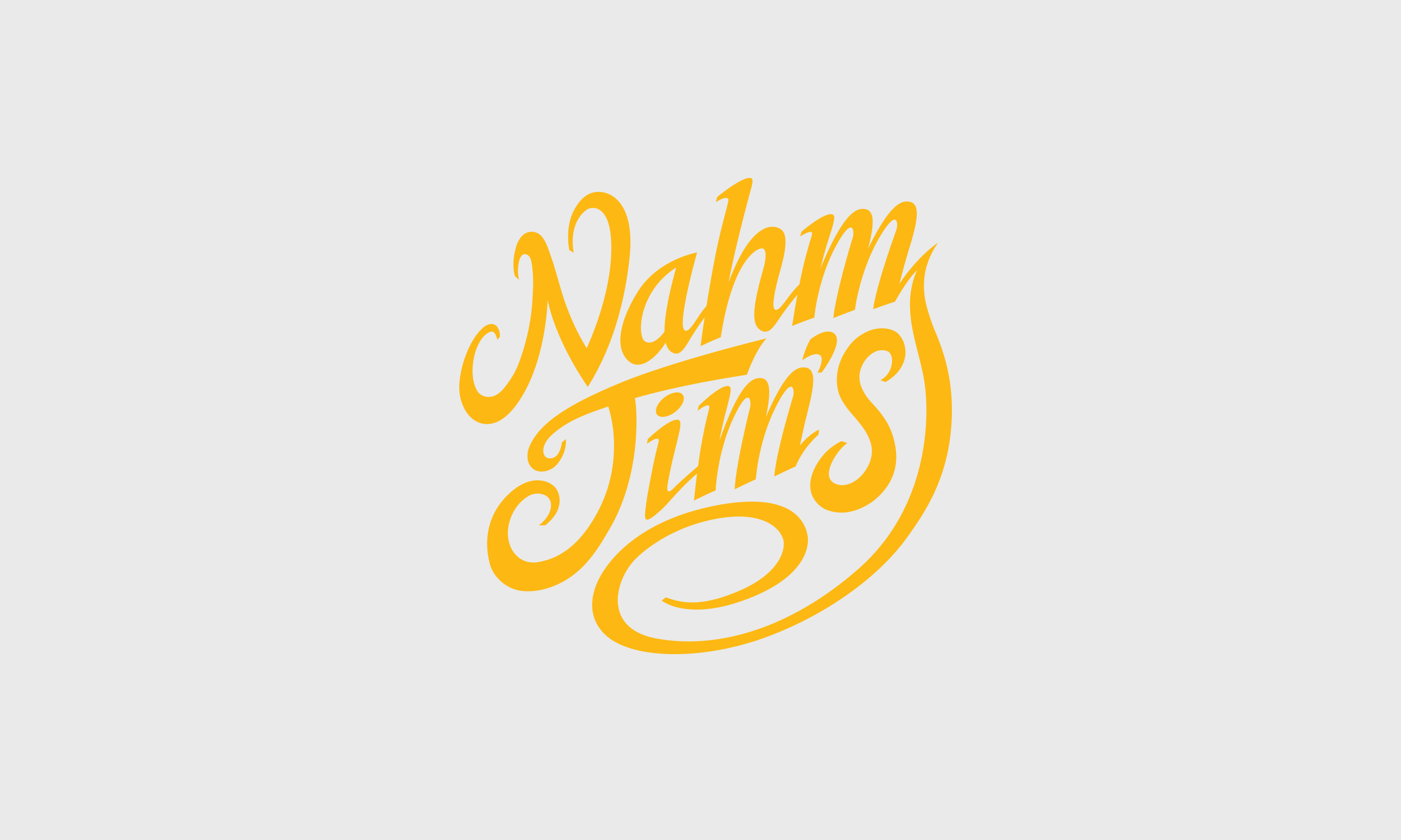
The Brief – Create a unique identity for an up market, contemporary Thai restaurant, including the interior design and application of the identity to all materials including menus, signage, advertising and website. The Solution – The flavours of the dishes at Nahm-Jim are authentic and traditional with all key ingredients flown in weekly from […]
Read More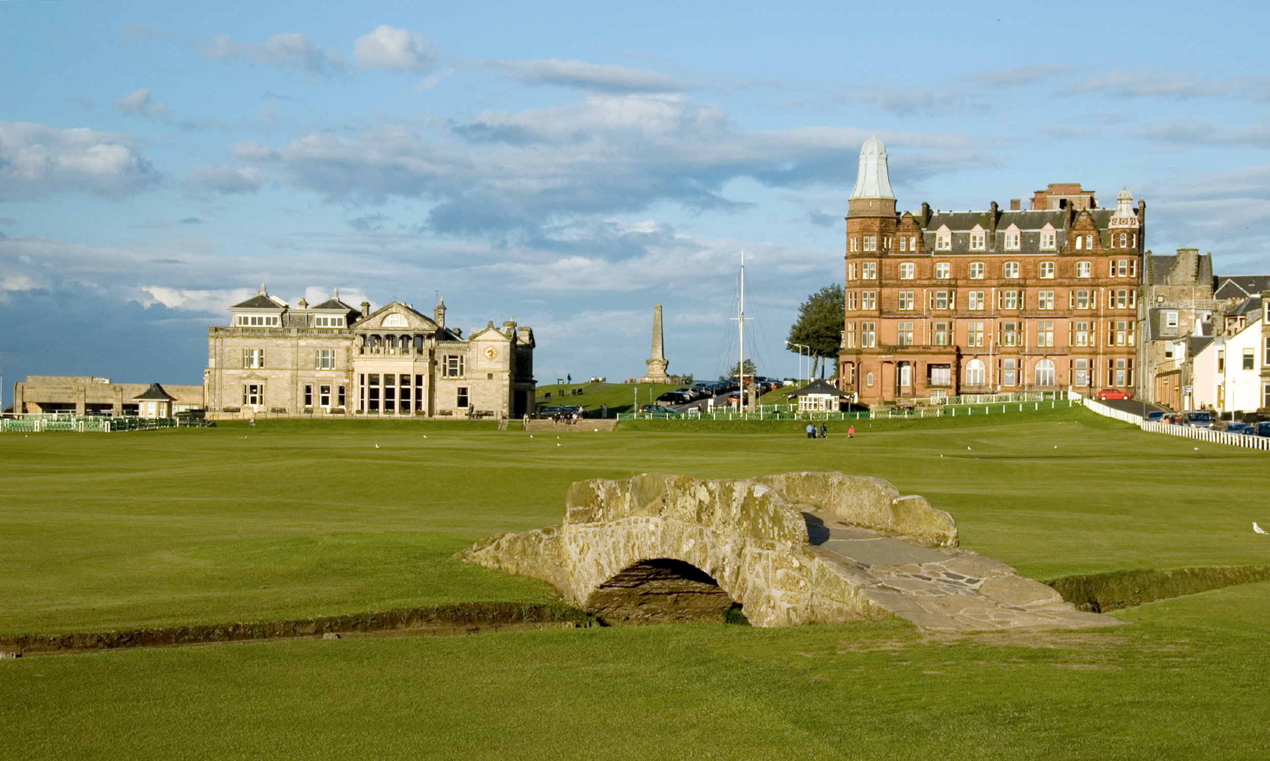
The Brief – Established in 1843, The St Andrews Golf Club is one of the most historic golf clubs in the world with its clubhouse overlooking the 18th green of the Old Course, home of the Open Championship. The club crest had not changed for almost 100 years but during this time had seen a […]
Read More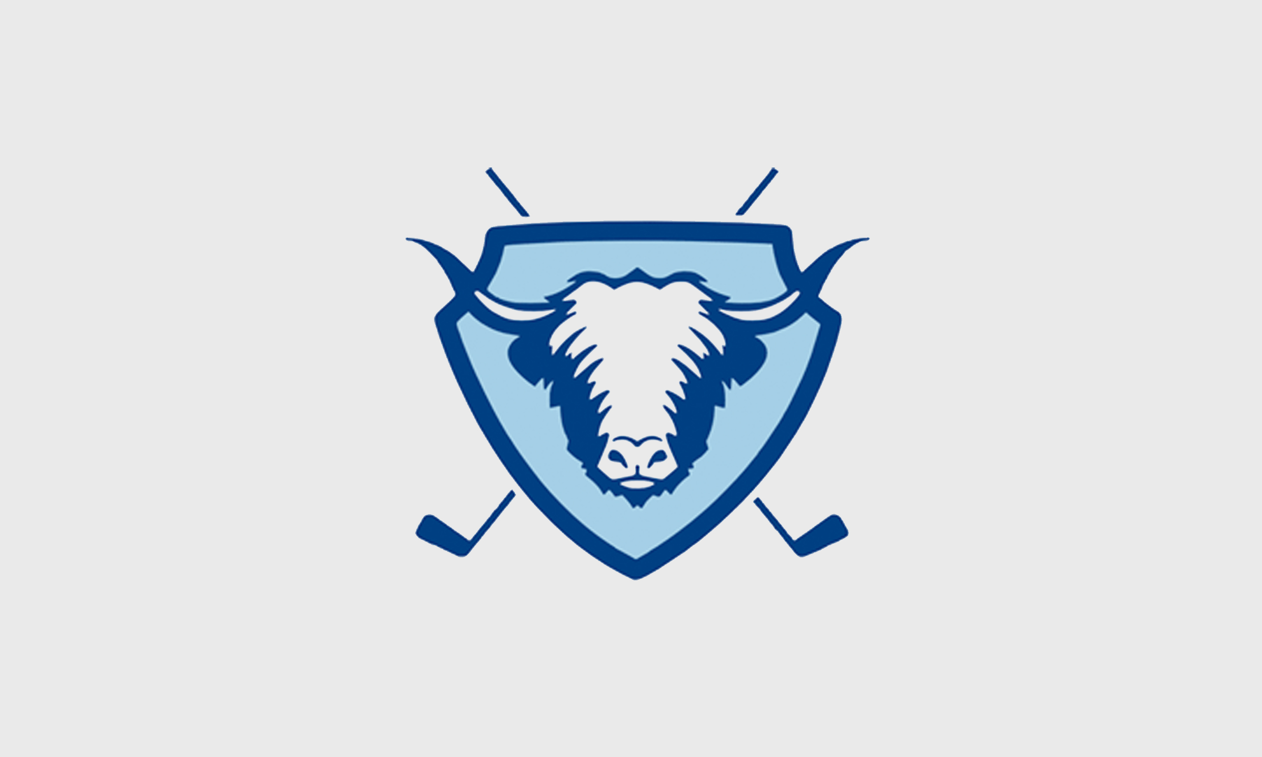
The Brief – Create a new brand identity for Rowallan Castle, the first golf course designed by former Ryder Cup Captain Colin Montgomery in his native Scotland. The Solution – Rather than use the more predictable iconography associated with the Castle housed on the grounds, the identity and crest uses an image of a […]
Read More
Identity work plus website design and development for Mason Williams, one of UK’s leading independent consumer PR agencies. Identity work involved a re-fresh of their current logo and style guide design. Web work included the design and build of a site using the WordPress CMS platform which allows for staff blogs, case studies, custom YouTube video implementation (with video sliders), integrated twitter feeds and newsletter management.
–
Mason Williams
www.mason-williams.co.uk
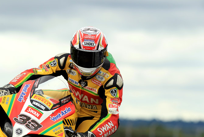
Swan approached us to create the branding and livery collateral for their British Super Bike Racing Team. This included designs for the race bikes, rider leathers, team apparel, race trailers, pit garage, hospitality unit and website among many other items. The 2011 British SuperBike Season was the perfect year as they had a terrific season, winning the championship. Tommy Hill was crowned champion by 0.006 seconds after a thrilling last lap scrap.
Photography courtesy of Tim Keeton
–
Swan Yamaha
www.swanyamaha.co.uk